Mobile / touch shortcuts
Below 768px the layout switches to a single-pane mobile mode with an off-canvas drawer for the sidebar.
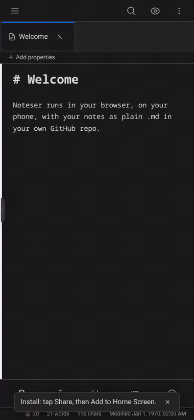
The mobile drawer and single-pane editor.
Edge-swipe drawer
- Right-swipe from within ~24px of the left edge → opens the sidebar drawer.
- Left-swipe anywhere with the drawer open → closes it.
Short swipes (<50px) or mostly-vertical motion (regular scrolling) are ignored — the gesture has to be deliberately horizontal.
Mobile formatting toolbar
A 5-button strip sits below the editor on mobile (phones lack the keyboard shortcuts):
- B — wrap selection in
**...**(bold). Tap again on the same selection to strip the markers. - I — same, with
_..._(italic). - H — cycle the current line's heading:
none → # → ## → ### → none. - • (Bullet) — toggle
-prefix on every selected line. - ☑ (Task) — toggle
- [ ]prefix on every selected line.
The toolbar hides in preview mode.
Empty-state CTAs
When no note is open, the editor pane shows two big buttons:
- Open today's daily note — same as the ribbon's daily-note icon.
- New note — adds a fresh "Untitled" and opens it.
Useful first-launch landing surface.
What's NOT on mobile
- The split-pane drag affordance (right-edge drop zone for tabs). One pane only on phones.
- The keyboard-shortcut bar in the editor header. Use the mobile formatting toolbar instead.
Tips
- Tap the hamburger in the top-left to toggle the drawer manually.
- Most modals (Settings, Search, Templates) are full-screen on phones so they don't get clipped.